
Sounds True One App & Platform
Product Design • Design System • UX/UI Design • Branding
To date, the platform has over 10k subscribers at $19.99 per month
DELIVERABLE
App Store Graphics, Design System, App Icon, App Design, Platform Branding, Product Integrations, UX Guidance
ROLE
Product Design, UX/UI Design, Art Direction, Web Design, Graphic Design
Creative Direction: Ryan Davis
Visual Design Support: Ella Moyer, Victoria Nguyen
Development Lead: Corbett Barr
TOOLS & SOFTWARE
Figma, Photoshop, Illustrator
PROJECT OVERVIEW
Sounds True, a multimedia publishing company, sought to develop a lifestyle app offering spiritual exploration, premium shows, and community access to members. This app would enable users to access content easily on their mobile devices, wherever they are. Priced at an affordable $19.99 per month, the subscription model was designed to be accessible to their target demographic and their needs while also providing a steady revenue stream to support the business.
KEY OBJECTIVES & APPROACH
-
Incorporate five different offerings (streaming, live events, community, digital library, and an ai)
-
Be a subsection of the Sounds True brand while also having a unique and distinct look
-
Look objectively at all requested features and develop a plan to phase them in over time.
-
Acquire 10k subscriptions within 1 year of launch
Art Direction
What is ST1, App Overview + Tutorial
What is Sounds True One?
Please watch the video below to get sense of the ST1 app, brand & offerings.
App Overview


Platform Tutorial
Branding
Key Features
App Icon
Once the platform branding was finalized, we knew we needed to design an app icon that not only fit our aesthetic but also stood out among the myriad of other apps on a user's phone. Collaborating with another visual designer, we based the app icon background on the branding of a previous show I had designed, as it aligned perfectly with our brand and vibe while giving it a unique look. We decided to add a thick, fading/transparent stroke to the tail of the wing to mimic movement and enhance the icon's visibility.

Below are the graphics I created from the ST1 Program Mystics Today that helped influence the app's background.

Design System
When developing a large app/platform, a strong design system is essential to streamline the design process and maintain brand consistency. Below are a few pages from our internal ST1 design system that I helped create and utilized in Figma.

Platform Graphics Overhaul
In addition to premium content shows, ST1 also offers numerous smaller shows and programs with individual teachers. We received a variety of headshots, differing in resolution, size, orientation, lighting, and overall quality. We needed a solution to elevate any headshots we received and ensure they all looked cohesive and aligned with the ST1 brand. Below is an example of how individual author shows & series appeared on the platform before intervention.

Below is the solution I developed to create cohesive, clean platform graphics regardless of the headshot quality. Solution 1 on the left-hand side uses a simple cutout of the author placed on ST1's light brand color gradients. Solution 2 on the right-hand side places the author on a natural background that complements the vibe of their show. I used a Photoshop editing action to ensure all photos felt as if they were shot in the same setting. The ST1 brand shapes surround the teacher in unique formations to draw interest and relate to the brand's "learning puzzle piece" concept.

UX/UI Design
Design Improvement & Product Intergrations
Watch Page
When the app first launched, it wasn't perfect. There were some known issues with design and development, but we proceeded with the launch, knowing we would phase in improvements and integrations over time. One of the biggest pieces of feedback we received from users was that they felt overwhelmed by the amount of content and couldn't easily find what they were looking for.
To address this issue, we needed to consider multiple fixes, including merchandising, the volume of content offered, the different program types (live, on-demand, premium), a sea of multiple colorful cards, and app-wide search functionality to reduce confusion and increase usability. See the screenshot below to view the old watch page:
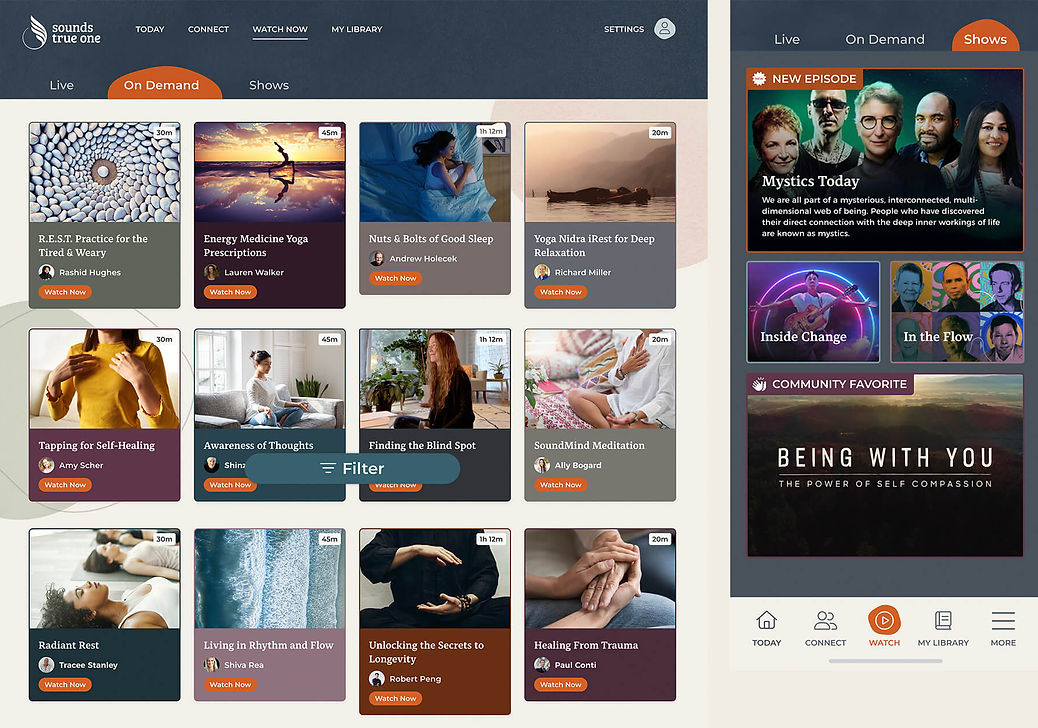
For the redesign, we decided to eliminate the double navigation issue that arose when users selected "Watch Now" from the primary sticky navigation. Instead, we consolidated everything onto a single page with various categories to aid in curation and make it easier for users to find what they're looking for. The page features a large, prominent banner ideal for advertising the latest shows. The dark, neutral page design provides a clean and cinematic look. Users and staff were pleased with the new look!

App Wide Search Exploration
Shortly after redesigning the watch page, our next initiative was to introduce app-wide search functionality. We delved into user feedback to understand their most common search queries, which typically involved searching for a teacher, topic, or locating items in their digital library. We prioritized these user needs while designing the search feature. Below are three different explorations:
Option 1:

Option 2:


Option 3:

Threaded Comments
Another major feature of the ST1 app, alongside premium shows and videos, was the Connect feature, designed to foster community building. At launch, this section of the app allowed users to engage with daily questions or prompts related to general wellness or delve deeper into discussions about shows and various topics. Users could comment on questions and favorite other users' responses, but the interaction was quite limited, leaving users wanting more.
To enhance this experience, we introduced threaded comments, enabling users to communicate more effectively with one another. Below, you can see the new design and different use cases:

DESKTOP & MOBILE
DESKTOP & MOBILE
DESKTOP & MOBILE
Branding
App Reviews
Apple Store Ratings and Reviews
Here are some user comments about their experience with the Sounds True One app:

All in one app
May 31
Theresa HJ
ST library content being brought to an app has been a huge improvement from a limited web experience. I especially appreciate having the Insights at the Edge live & recorded videos to watch as it further brings the podcast to life. Excited to see what comes next with this app!
An amazing community
Jun 1
plantmom101
The sounds true one community is truly special. It's been so great to be here from the launch of the app and watch as a community has grown together through a collective journey. Can't wait to see what's to come with this app.
Content that is worth consuming
1y ago
dancabre
If you are interested on mindfulness, meditation, and/or spiritual growth, this app has it all, and it offers a great opportunity to connect with a beautiful community. The app is easy to use and beautiful, one can tell they care, that what it's being offer matters, that the community matters.